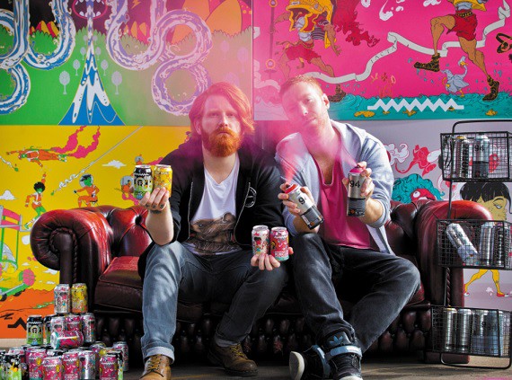
Now, not every beer brand will be lucky enough to have an aspiring artist working in its logistics team and there are other approaches that can be taken.
Johnny Paton, creative director at Kingdom & Sparrow, adds: “The stripped back and simplistic approach is another style which has become popular. This lends itself to a craft brewery which wants to bring out lots of different varieties, because essentially there’s not much that needs changing other than maybe the name and a colour scheme.
Redchurch brewery in London used design agency Bibliothèque to undergo a full redesign of all its beers. Sales representative Carrie Fleetwood says: “We’ve been around for seven years now and we went to Bibliothèque for a redesign two years ago. It gave us a minimalist style with our own unique font. I think this simple style works well for us because our look will never date. It’s timeless.”
The use of a long-lasting design is key, according to Ben Lambert, co-director of London-based brand and packaging design agency PB Creative.
“Creating unique and ownable brand equities that will stand the test of time is important. Get this right and new variants and sub-categories can be introduced without diminishing that carefully crafted identity – and target consumers will still relate to and understand who you are and what you’re offering. Get it wrong and you risk confusing and alienating consumers”.
REFRESHING BEER
A lot brands already have a strong look and reputation, but often they will look to refresh an image to reconnect with their audience. According to Gradwell at Kingdom & Sparrow, the agency deals with a 60-40% split of new brands looking to build an identity and companies looking to refresh their existing look.
“We tend to get a lot of small businesses coming to us for brand building,” he says. “But in terms of rebrands this tends to be the more established names looking for a way to tap into the craft market.”
Tennent’s lager, Scotland’s most popular beer brand, recently underwent a rebrand with a different intention. It’s new can design aims to highlight the quality of the liquid rather than giving it a hipster, alternative image.
Gradwell says: “The thing we need to think about most with a rebrand is that we don’t upset any of the reputation which the beer has already built over time. It’s more about communicating the same message but in a different way.
“It’s much easier for a new brand to be bold because it can’t really lose any of its audience and there’s less red tape for it to get through.”
MONEY, MONEY, MONEY
Cash is another factor which contributes to the design of a beer brand – the more there is the greater the possibilities.
“The budget makes a big difference to what we can do with a design,” says Paton. “If a brand has a big budget we can play around with different finishes and things such as gold print labelling, but if it’s the opposite we get a different type of challenge by doing as much as we can with finite resources.”


